
Successful.
Uh this is amazing. This is a self portrait of Shore in the 70s. When I first saw this I quickly was annoyed by the bottom of the image because I don't like where it cuts off but the top of the image is so important and so perfect that it doesn't even matter. Yellow Yellow Blue Blue?!?! With black and white and...purple? Stephen Shore is kind of great. I really dig this image.
Successful.
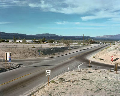
Absolutely amazing. I love the fact that this is all so tilted and the horizon line is straight across. The inclusion of the signs and...wait for it...color as punctuation all make this a spectacular image. I also find the multiple divisions in the center area interesting. From the blue sky to the plain gray mountains, back to color with green trees, then a return to gray roads and desert land with only a few bits of color to pop out.

Not as successful.
I understand the intent with color here trying to bring the orange back around the frame but I feel like this image just isn't very interesting at all. For whatever reason, I just don't like looking at it. It does nothing for me, and I think that's enough to make it fit this answer. I don't like to say "unsuccessful" but just...not as successful.
No comments:
Post a Comment